Minimalism with WordPress
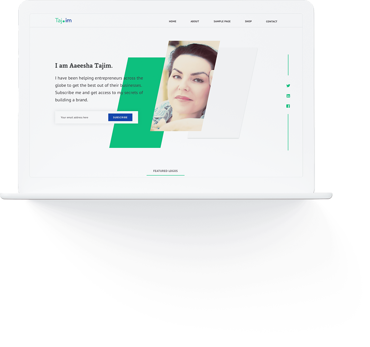
I convinced the client to go with a minimal design. A minimal, well lit space encourages participation and honest transparent communication. But crafting minimalism wasn’t easy. As the number of styles reduced, I had to pay extra attention to white space, colors and typography.
Wireframes & prototypes
With an assignment to create a minimalist website, I focused on typography and white space, which reinforces transprancey and professionalism.
Tools
- Sketch
SCREENS DESIGNED
- 20+
colors

Mobile friendly
I used responsive web design and feature detection to deliver an optimized experience across all devices. The presentation changed but the core content was consistent everywhere.
TESTED ON
- Multiple andriod & iOS devices
- HD & retina displays
- iPads & tablets

A summary of my deliverables
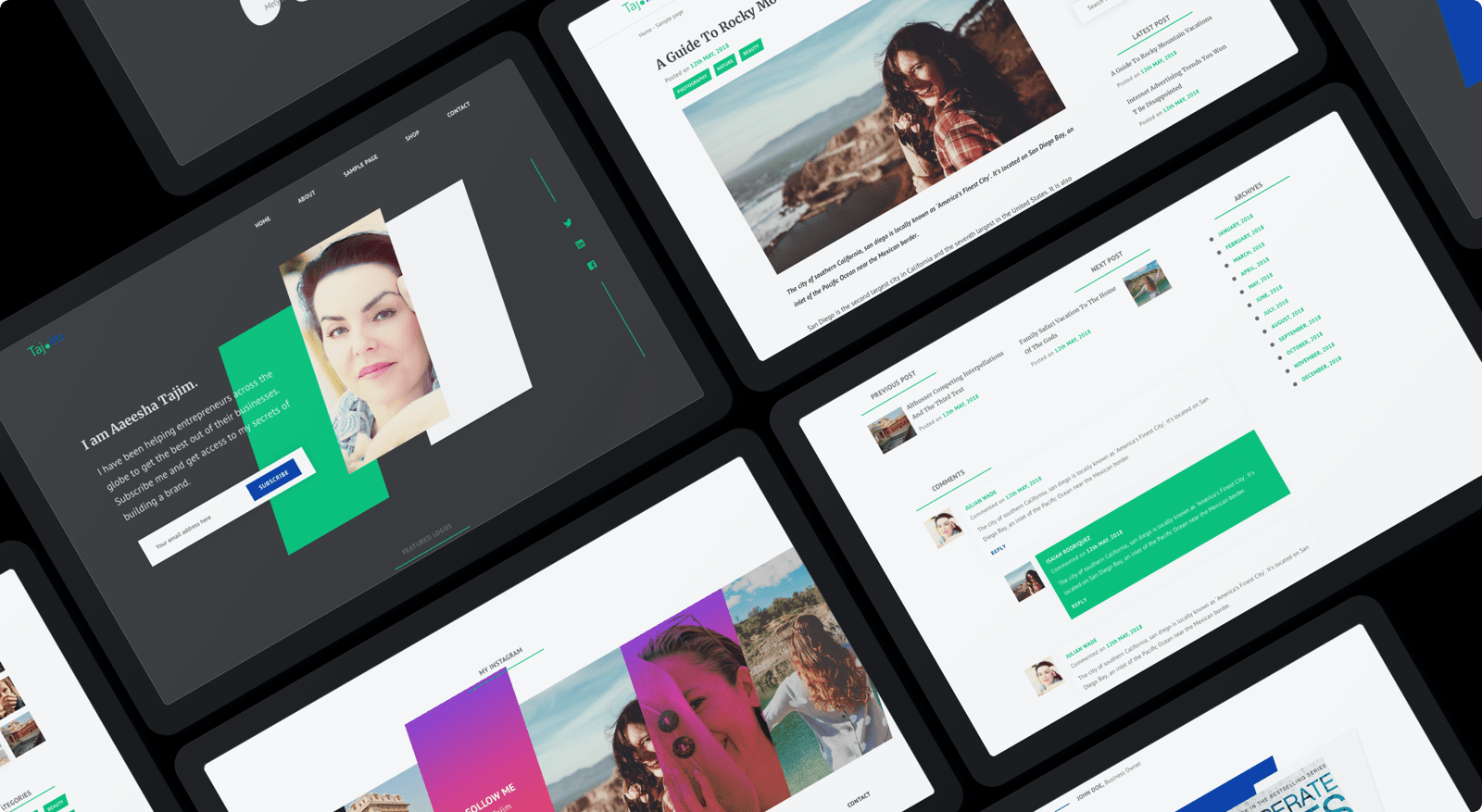
I created a user interface thats beyond anything you would expect from a author’s website. Theme Thread is minimal, has a lot of well lit spaces, bold typography and clear message that not only grabbed user’s attention but also conveyed trust and professionalism.
UX
- Product summary
- Information architecture
- Wireframes
UI
- 100+ screens
- Clickable prototypes
- Sketch assets
- Style guide
FRONTEND
- DNW
BACKEND
- DNW

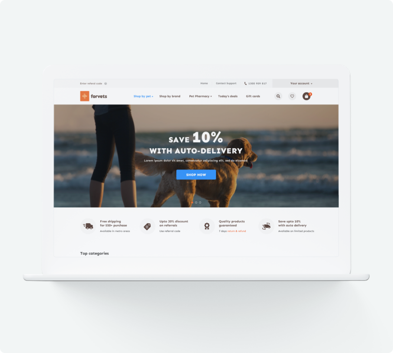
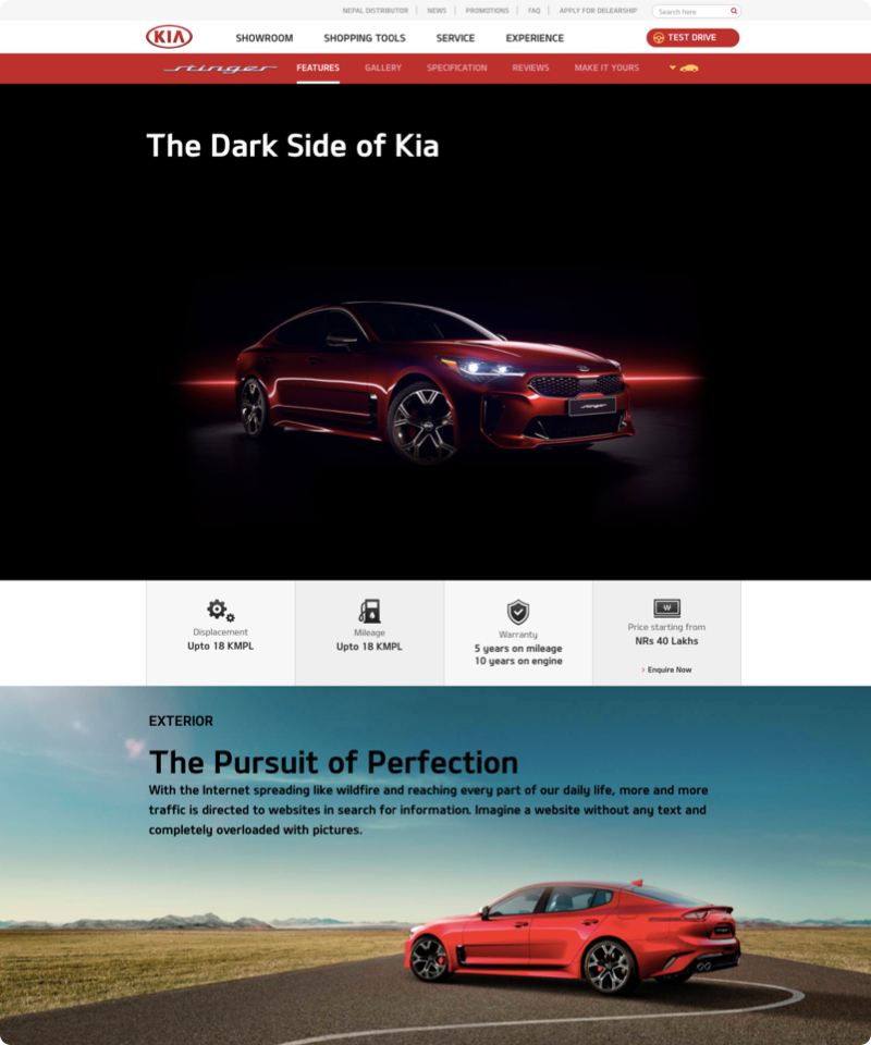
You might want to check similar projects
Give me a challenge
Let’s talk about your ideas. Book a meeting with me at your
convenience and give me a challenge.


